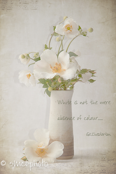
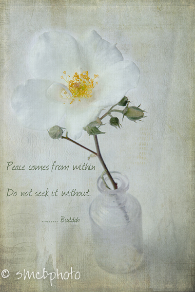
Texture Tuesday this week needed to use at least one of Kim’s textures, and be based on the colour white – which really isn’t a colour at all if one gets technical.
G.K. Chesterton said “White is not a mere absence of colour: it is a shining and affirmative thing, as fierce as red, as definite as black. God paints in many colours: but he never paints so gorgeously, I had almost said so gaudily, as when he paints in white.”
White is a colour used to signify purity, virtue, innocence, and peace. In many countries it is used to signify death, mourning or rebirth. It has been used to denote political sides for centuries for example the White Rose of York in the Wars of the Roses, and in Russia at the time of the revolution, White Russians were supporters of the Tsar. It has often been used to signify good (white) versus bad (black) – even in such things as the early cowboy movies. Remember the goodies wore white hats, and the outlaws all had black ones? Then of course, there are totally white gardens, Sissinghurst in Kent was developed by author and gardener, Vita Sackville -West with her husband Harold Nicolson in the 1930’s was probably the first one, but it started a fashion which continues today.
Anyway, enough of my babble……..here are my images for this week. All using at least two textures from Kim Klassen, using various blending modes and levels of opacity.


Beautiful pictures and nice work.
All three of these are beautiful. Love your work.
lovely flowers.. great job! 🙂
These are so beautiful! Love your photography! And love those girls, I can see why they make you happy!
Love it! 🙂
And if I may, there is no black and white in life, except the colors black and white, and even they each have all the colors in them. 😉
Your photos are stunning with a soft and natural, living touch.
All three of these are gorgeous!
Now I have a song in my head … beautiful photos as always.
Judy B
Your lovely photos belong in a Most Beautiful Flowers book!